ShowBusinessMan [Search results for People]
Island of Free Love

Saatchi & Saatchi and CoorDown Turn Up The Voices of People With Down Syndrome

Milk Every Moment Ads "Curiosity" "Anthem" "Fun"

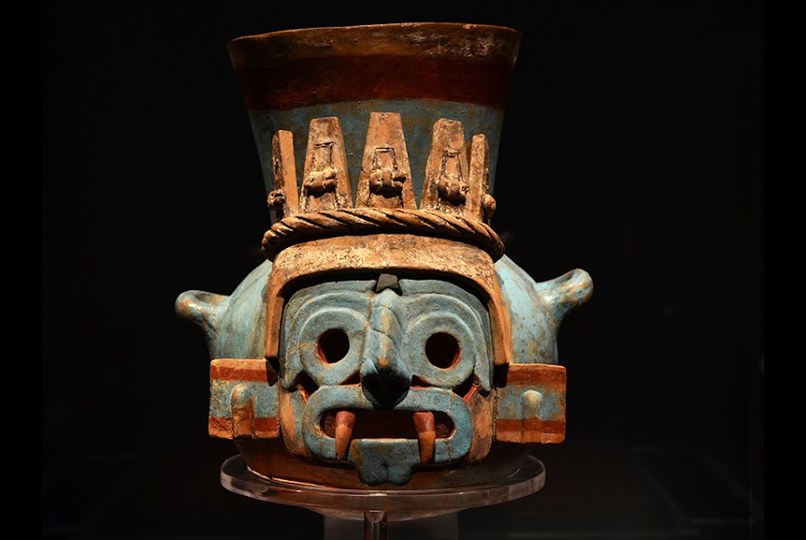
'The Aztecs, People of the Sun' at Pointe-à-Callière in Montreal
Toronto SickKids Sing "You Got It" in New "Together We Will" Ad

People and Planet Positive — IKEA Unveils New Sustainability Strategy

6 Disabled Squatters Preform "Our House" To Raise Awareness For Inclusie Invest

Canadian Breast Cancer Foundation — Run For The Future

Mercedes-Benz smart "The Simplest Test Drive Ever" by BBDO

Toronto Copywriter Has Had It With Shameless TTC Riders

The G Project: What will you do today, for tomorrow?

Virgin Atlantic Fly In The Face of Ordinary Epic New TV Advert

A Cell Phone Company Promotes Putting Down Our Mobile Phones

&Rosàs Captures The Orgasmic Experience Between One Man & His Bike For New Decathlon Ad

London Street Graffiti Is Spell Checked by Online Tutor Firm

Live Augmented Reality for National Geographic / UPC
The Kool-Aid Man Is Back In New "Smile" Ads...Oh Yeah!

'Indigenous Australia: Enduring Civilisation' at the British Museum

Meet the archaeologists making ancient rock art into 3D reality

The Vikings Exhibition at Discovery Times Square, NY
