ShowBusinessMan [Search results for quality]
Trojan Condoms Takes To The Streets With Vibrations Pleasure Cart

Than essentially better VigRx?
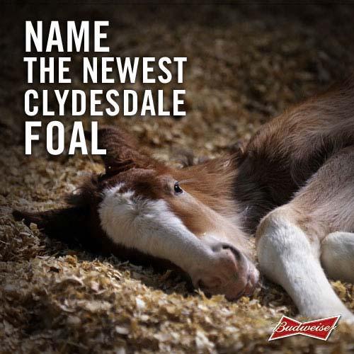
Super Bowl Ad Watch: Budweiser Tweets For The First Time — Name The New Clydesdale Foal
A Collection Vintage Dickies Menswear Print Ads

Louis Vuitton Handbags

Samsonsite VERSUS the World Campaign

Grey London Creates "The Swell" for the new Volvo XC60

Meet the archaeologists making ancient rock art into 3D reality

dabball App Ode to the Famous Peanut Butter Cup Ad

New Arco Gas "Pumping" TV Commercial

Ontario Kids Stick It To Fast Food Urge Us All To Join In Boycott

"A Taste of ABC Sunday" | Prime-Time Promo

Kevin Spacey for American Airlines "The Individual " Ad Campaign

65,000 Ping Pong Balls and The AquaLillies Are The Makings Of A Great Pool Party

Elmer's Glue "Let's Bond" TV Commercial

M&S Marks & Spencer: The Art of Summer (UK :30)

How To Adapt Your Brand Image Across Languages and Cultures

Ravens Ray Rice Celebrate Super Bowl Win With A "Got Milk" Mustache

Toyota Camry Reinvented 2012 Ad Campaign

9 New York City Street Inspired Watch Designs by Hudson River

